Great design doesn’t stop when a file is finalized and exported, but that’s often where control feels lost.
For many marketers and designers, the handoff from design to print can feel like crossing an invisible line. Once files leave the designer’s desk, questions start to surface: Will the colors print the way they look on screen? Will the details hold up? Did we prepare this correctly? These concerns are valid, and they are exactly where the gap between design and print tends to show up.
At Tru Art Color Graphics, we see this moment not as a risk, but as an opportunity. When designers, marketers, and printers work together with a shared understanding of the process, the result is stronger print, fewer surprises, and a finished piece that stays true to the original vision.
Why does design sometimes change in print?
One of the most common questions we hear is: “Why doesn’t my printed piece look exactly like it did on my screen?”
The short answer: screens and presses speak different languages.
Design software displays color using RGB (red, green, blue) light, while commercial printing relies on CMYK inks—or, in some cases, spot colors like Pantones. Add variables like paper stock, coatings, ink absorption, and finishing techniques, and it becomes clear why print requires its own set of rules.
That doesn’t mean designers lose control; it means the process needs a translator. This is where prepress plays a critical role.
What exactly happens in prepress?
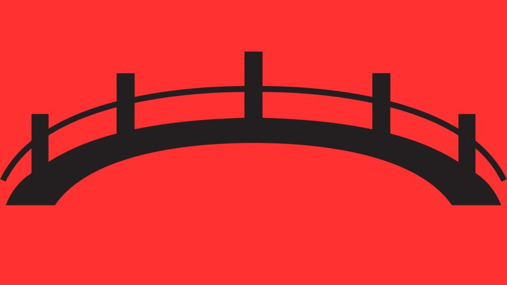
Prepress is the bridge between creative intent and physical production. It’s the stage where files are reviewed, adjusted, and prepared to ensure they print accurately and efficiently.
Clients often ask: “If my file is ‘print-ready,’ why does it still need to be reviewed?”
Because “print-ready” isn’t universal.
Our prepress team checks resolution, color spaces, bleeds, trims, fonts, and layout integrity. We look for issues that might not be visible on screen but could cause problems on press—like low-resolution images, missing bleeds, or colors that won’t reproduce as expected.
More importantly, we communicate. If something needs attention, we don’t quietly fix it and move on. We reach out, explain the issue, and talk through the best solution, so everyone understands why a change is being made.
How do you protect color accuracy?
Color is one of the biggest sources of concern in commercial printing, and for good reason. Brand colors carry meaning, recognition, and trust.
A frequent question is: “How can I be confident my brand colors will stay consistent?”
It starts with defining color correctly, whether that’s using Pantone values for spot colors or professionally managed CMYK builds. From there, calibrated equipment, standardized workflows, and color-managed proofing ensure predictability.
Proofs are critical. They provide a shared reference point before production begins, allowing everyone to align expectations. When clients review a calibrated proof, they’re not guessing; they are seeing a reliable preview of how the final piece will print.
What can designers do to set files up for success?
Another common question we hear is: “What can we do on our end to make this easier?”
A few best practices go a long way:
- Build files at full size whenever possible.
- Use high-resolution images (typically 300 dpi for print).
- Include proper bleeds and safe margins.
- Clearly define brand colors.
- Communicate early if a project has unique requirements or tight tolerances.
Even with best practices in place, questions will still arise, and that’s okay. Print is a physical process, and every project has nuances. The goal isn’t guesswork; it’s achieving alignment before production begins so the final result is executed perfectly on press.
Is digital printing as accurate as offset?
Clients often ask: “Does digital printing sacrifice quality or consistency?”
The answer today is no, when managed correctly.
Advancements in digital press technology, color calibration, and workflow integration have narrowed the gap significantly. In many cases, digital printing delivers excellent color consistency, faster turnarounds, and greater flexibility, especially for shorter runs or variable data projects.
Choosing between digital and offset isn’t about “better or worse.” It’s about selecting the right tool for the job, based on quantity, timeline, substrate, and goals.
Why collaboration matters more than ever
Perhaps the most important question isn’t technical at all: “Why should we involve our printer earlier?”
Because print works best when it’s part of the conversation, not the last step.
When we understand the purpose of a piece, how it will be used, and what success looks like, we can help anticipate challenges before they become problems. That might mean recommending a different stock, adjusting a design element for better legibility, or suggesting a proofing approach that reduces risk.
Our role isn’t to take over creative control. It’s to protect it.
Closing the gap—for better results
Designers don’t lose control when files leave their desk. Control simply shifts from individual execution to shared responsibility.
By understanding the print process, asking the right questions, and engaging early, clients gain confidence that their ideas will carry through from screen to press to finished piece. At Tru Art Color Graphics, we believe the strongest print results come from clear communication, technical expertise, and a genuine commitment to delivering work that reflects our clients’ vision. When design and print production work together, the gap is minimized, and what’s left is print that performs.