Personalization has become one of the most talked-about goals in marketing. Most businesses understand the appeal. A message that feels relevant is more likely to get noticed, remembered, and acted on. The challenge is not understanding why personalization matters. The challenge is to do it well at scale without creating confusion, delays, or unnecessary waste.
That is where variable data printing is changing the conversation.
Variable data printing, often called VDP, allows individual elements within a printed piece to change from one recipient to the next in a single production run. Names, locations, offers, images, messages, QR codes, and even personalized URLs can all be adjusted based on the data behind the campaign. Instead of sending one generic message to everyone, businesses can create printed communications that feel more specific and more useful to the people receiving them.
At Tru Art Color Graphics, we believe print works better when it speaks more directly to the audience it is meant to reach. With high-production inkjet technology, strong print quality, and a clean data process, personalized print becomes more than a creative idea. It becomes a practical, efficient marketing tool. Tru Art’s inkjet platform supports high-speed personalization, quick turnarounds, and compatibility across a wide range of applications, helping clients move from broad messaging to targeted communication without sacrificing quality.
Why personalization in print matters
Today’s customers are surrounded by messages. Generic marketing often gets ignored because it asks too much of the audience. It asks them to figure out whether the message applies to them. Personalization removes some of that friction.
A printed piece that reflects the recipient’s name, region, purchase behavior, or interests feels more intentional. It signals that the sender has taken the time to make the communication relevant. That does not just improve response potential. It improves the overall impression of the brand.
This is especially important in direct mail, where relevance can make the difference between a piece that gets glanced at and discarded and one that gets read, saved, scanned, or acted on. Tru Art’s VDP capabilities are particularly valuable in direct mail because they allow data-driven messages to be paired with in-house mailing expertise and postal support, creating a more complete and more accurate campaign process.
Questions our clients ask about variable data printing
“What exactly can be personalized?”
More than many people realize.
Variable data printing can personalize names, addresses, local details, product recommendations, loyalty information, seasonal messaging, event invitations, QR codes, and personalized landing page links. In many cases, images can also change based on the audience segment. That means one campaign can contain many versions, all produced efficiently within the same run.
“Will personalization make the process more complicated?”
It can be if the data is not organized.
That is why personalization works best when good printing is supported by good process. Clean data matters. Accurate records, thoughtful segmentation, and a clear plan for how information will be used are what keep personalization from turning into chaos. Tru Art’s approach is not just about printing variable information. It is about helping clients create a workflow that keeps the campaign organized, accurate, and manageable from file setup to final output.
“Is this only useful for direct mail?”
Not at all.
Direct mail is one of the strongest uses for VDP, but it is not the only one. Personalized brochures, event materials, customer thank-you pieces, fundraising appeals, regional sales collateral, and customized leave-behinds can all benefit from variable data. Any time a business wants one campaign to speak differently to different audiences, VDP deserves consideration. Tru Art’s inkjet technology expands those possibilities by making personalized print more flexible and more production friendly.
“Can personalized print still look polished and professional?”
Absolutely, if the technology and process are strong.
Years ago, some businesses may have viewed digital personalization as a compromise. That is no longer the case. Advances in digital and inkjet printing have significantly improved print quality, color performance, speed, and consistency. Today’s production inkjet platforms allow marketers to personalize at a high level while still maintaining the visual quality and professionalism expected from a commercial print partner.
“What is the benefit of using inkjet for personalization?”
Speed, flexibility, and efficiency.
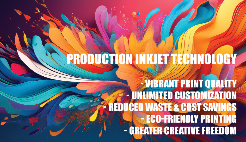
Production inkjet helps make variable data printing practical on a larger scale. Tru Art’s platform supports fast output, strong resolution, quick drying, and the ability to work across a broad range of stocks. It allows clients to produce shorter runs, targeted versions, and updated messaging without the burden of traditional setup methods that are less suited for changing data. That gives businesses a way to be more responsive without losing control of the finished product.
Personalization should feel intentional, not automated
The best personalized campaigns are not personal simply because a name was dropped into a headline. They work because the message itself is relevant. That takes thought. It takes asking better questions about the audience, timing, behavior, and goals.
That is where the value of a strong print partner becomes clear.
At Tru Art Color Graphics, we do more than produce the final piece. We help clients think through how personalization should work, where it adds the most value, and how to execute it in a way that feels seamless instead of scattered. We believe better outcomes come from understanding the purpose behind the project, then using the right technology to support it. That consultative, collaborative mindset reflects Tru Art’s broader commitment to helping clients succeed through creative solutions, manufacturing strength, and thoughtful support across the process.
The new role of variable data printing
Variable data printing is no longer a niche tactic. It is becoming a smarter standard for businesses that want their print marketing to be more targeted, more useful, and more effective.
Personalization at scale does not have to mean complexity without control. With the right data, the right strategy, and the right technology behind it, print can become more relevant without becoming more chaotic.
That is the opportunity.
Tru Art Color Graphics helps businesses bring personalization to life through high-speed inkjet production, clean execution, and a process built to support quality from start to finish. When every piece has the chance to speak more directly to the person receiving it, reflecting their name, region, purchase behavior, or interests, the communication feels more intentional and relevant. That not only improves response potential but also strengthens the overall impression of the brand. In that moment, print stops being generic and starts performing the way it should.
